# Prepare environment ----------------------------------------------------------

# Load packages (install if you don't have it)
library(ggfortify) # for default biplots

# Keep the numeric variables from the iris dataset.
X <- iris[1:4]Introduction
Principal Component Analysis (PCA) is a technique that finds a low-dimensional representation of a large set of variables contained in an \(n \times p\) data matrix \(\mathbf{X}\) with minimal loss of information. In terms of visualization techniques, PCA allows the representation of large datasets in a bi-dimensional plot. In general, biplots give use a simultaneous representation of \(n\) observations and \(p\) variables on a single bi-dimensional plot. More precisely, biplots represent the scatterplot of the observations on the first two principal components computed by PCA and the relative position of the \(p\) variables in a two-dimensional space. For an in-depth discussion, I recommend reading Jolliffe (2002, 90).
Learn by coding
Let us start by loading the ggfortify R package, which provides pleasant looking biplots. We will work with the first four columns of the iris data, which report the length and width of petals and sepals in plants for the iris flowering plant.
We then use the prcomp R function to compute the PCs of X. We specify the prcomp function to not scale and standardize the data because we rather have more control over how the standardization is performed.
# Perform PCA ------------------------------------------------------------------

# Center and standardize the data
X_sc <- scale(X)

# Compute PCs
pca_res <- prcomp(X_sc, center = FALSE, scale. = FALSE)

# Generate default biplot with ggfortify
autoplot(pca_res,
    data = X,
    loadings.label = TRUE,
    loadings.colour = "blue"
)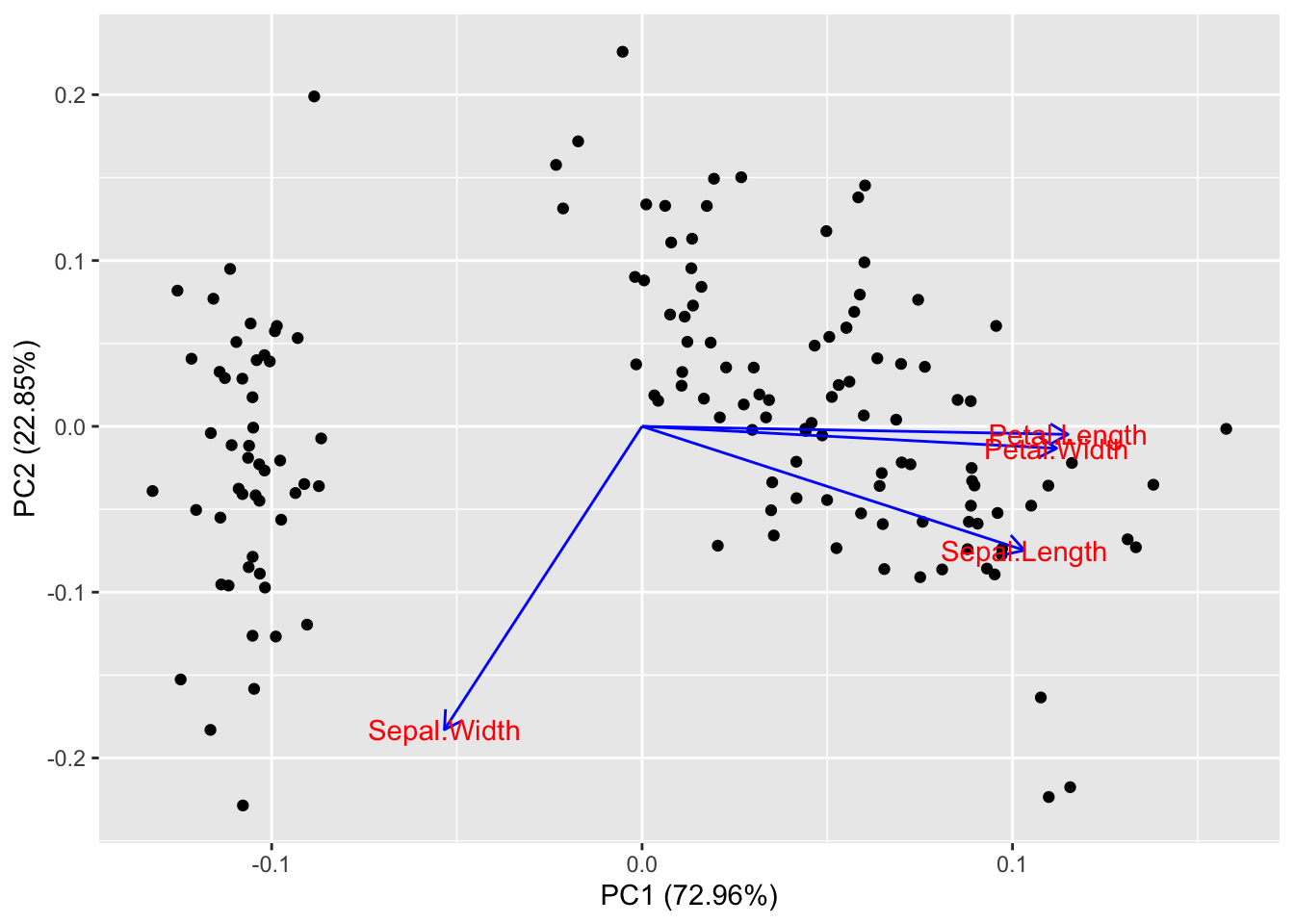
and print the biplot obtained with the ggfortify::autoplot() function. We specify which data should be plotted (data = X), and we require the loadings to be included in the plot as blue arrows (loadings.colour = "blue" and loadings.label = TRUE.)
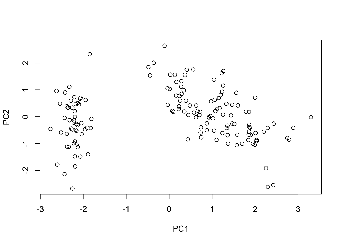
Now we replicate this plot by doing all the work ourselves. First, let’s start by computing the PC scores ourselves by taking the singular value decomposition of X and computing the PC scores \(T\).
# Getting to the biplots -------------------------------------------------------

# SVD of X
x_svd <- svd(X_sc)

# Extract the parts of the SVD we need to compute the Principal Component scores
U <- x_svd$u
D <- diag(x_svd$d)
V <- x_svd$v

# Compute the PCs
T <- U %*% D
We can now make a scatter plot of the observations based on how they score on the first two PCs we computed.
# > Simple scatter plot --------------------------------------------------------

plot(
    x = T[, 1], xlab = "PC1",
    y = T[, 2], ylab = "PC2"
)
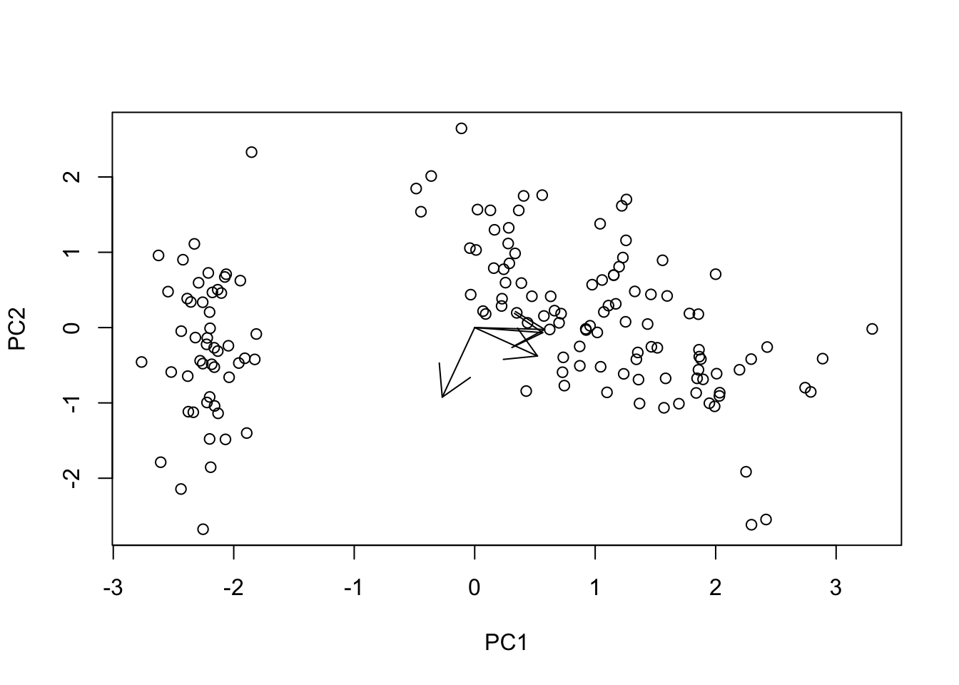
The next step is to overlay the arrows plotting the information regarding the loadings. We want to plot a single arrow for each column of the original data, starting at the center of the plot (\(PC1 = 0\), and \(PC2 = 0\)) and ending at the coordinates described by the first two columns of the component loadings matrix \(V\).
# > Adding loading arrows ------------------------------------------------------

# Scatter plot
plot(
    x = T[, 1], xlab = "PC1",
    y = T[, 2], ylab = "PC2"
)

# Add arrows from 0 to loading on the selected PCs (scaled up)
arrows(
    x0 = rep(0, ncol(X)), x1 = V[, 1],
    y0 = rep(0, ncol(X)), y1 = V[, 2]
)
We can improve the visualization by adding a few teaks. Let’s add a title, make the scatterplot symbols gray solid dots, scale up the arrow size, and add labels indicating which loading we are plotting with any given arrow.
# > Improving the visuals ------------------------------------------------------

# Define a scaling factor for the arrows
sf <- 2

# Start over with the original scatterplot
plot(
    x = T[, 1], xlab = "PC1",
    y = T[, 2], ylab = "PC2",
    main = "PCA biplot", # plot title
    col = "gray",
    pch = 19 # solid circle
)

# Add arrows from 0 to loading on the selected PCs (scaled up)
arrows(
    x0 = rep(0, ncol(X)), x1 = V[, 1] * sf,
    y0 = rep(0, ncol(X)), y1 = V[, 2] * sf,
    col = "darkgray"
)

# Add names of variables per arrow
text(x = V[, 1] * sf, y = V[, 2] * sf, labels = colnames(X))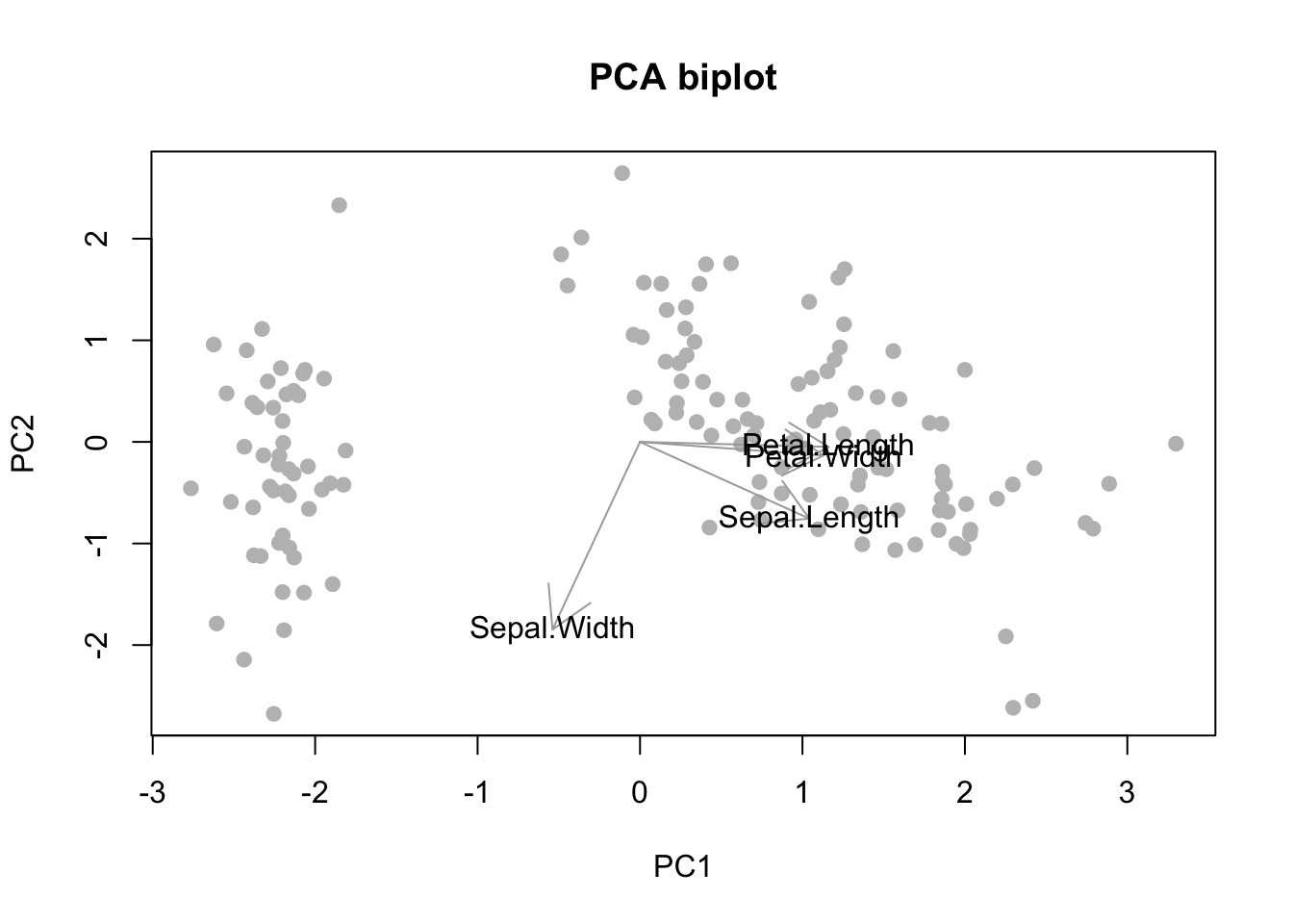
The scaling we performed is ad-hoc. We looked at the plot and decided to increase the size of the arrows by an arbitrary scaling factor. In the literature on biplots it is more common to scale both component scores and loadings by taking powers of the diagonal matrix \(D\) and recomputing the coordinates1.
TL;DR, just give me the code!
# Prepare environment ----------------------------------------------------------

# Load packages (install if you don't have it)
library(ggfortify) # for default biplots

# Keep the numeric variables from the iris dataset.
X <- iris[1:4]

# Perform PCA ------------------------------------------------------------------

# Center and standardize the data
X_sc <- scale(X)

# Compute PCs
pca_res <- prcomp(X_sc, center = FALSE, scale. = FALSE)

# Generate default biplot with ggfortify
autoplot(pca_res,
    data = X,
    loadings.label = TRUE,
    loadings.colour = "blue"
)

# Getting to the biplots -------------------------------------------------------

# SVD of X
x_svd <- svd(X_sc)

# Extract the parts of the SVD we need to compute the Principal Component scores
U <- x_svd$u
D <- diag(x_svd$d)
V <- x_svd$v

# Compute the PCs
T <- U %*% D

# > Simple scatter plot --------------------------------------------------------

plot(
    x = T[, 1], xlab = "PC1",
    y = T[, 2], ylab = "PC2"
)

# > Adding loading arrows ------------------------------------------------------

# Scatter plot
plot(
    x = T[, 1], xlab = "PC1",
    y = T[, 2], ylab = "PC2"
)

# Add arrows from 0 to loading on the selected PCs (scaled up)
arrows(
    x0 = rep(0, ncol(X)), x1 = V[, 1],
    y0 = rep(0, ncol(X)), y1 = V[, 2]
)

# > Improving the visuals ------------------------------------------------------

# Define a scaling factor for the arrows
sf <- 2

# Start over with the original scatterplot
plot(
    x = T[, 1], xlab = "PC1",
    y = T[, 2], ylab = "PC2",
    main = "PCA biplot", # plot title
    col = "gray",
    pch = 19 # solid circle
)

# Add arrows from 0 to loading on the selected PCs (scaled up)
arrows(
    x0 = rep(0, ncol(X)), x1 = V[, 1] * sf,
    y0 = rep(0, ncol(X)), y1 = V[, 2] * sf,
    col = "darkgray"
)

# Add names of variables per arrow
text(x = V[, 1] * sf, y = V[, 2] * sf, labels = colnames(X))
References
Jolliffe, Ian T. 2002. Principal Component Analysis. Springer.